
In a sentence — score what leadership says about its appetite for disruption against what its actual past behaviour supports, and let the gap between the two be the finding.
Ask a room how much disruption they can absorb and you'll get an optimistic answer almost every time — not because anyone's lying, but because stated appetite and demonstrated appetite are genuinely different things. This tool scores both, on purpose, rather than settling for whichever one gets said out loud first.
A large gap isn't a scoring error to smooth over — it's diagnostic data that Steps 2 and 9 need, and the sheet is built to surface it automatically rather than let it get averaged away. As a rule of thumb, an average gap of around a full point or more across several dimensions is a strong signal to build more evidence gates into the plan before committing full resource, rather than assuming the stated appetite will hold once it's tested against a real, unpopular decision.
WHY THIS HELPS
There's a named sceptic's adjustment for organisations with a failed transformation in their past. If change has been tried before and didn't hold, the demonstrated average on its own can still be too generous — the adjustment exists so that history isn't quietly ignored.
READING THE GAP, DIMENSION BY DIMENSION
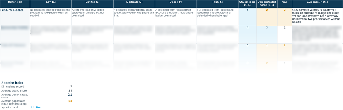
Gap is Stated minus Demonstrated, calculated per dimension before anything gets averaged, which matters: a programme can carry one badly overclaiming dimension (Sponsorship Visibility stated at 5, demonstrated at 2) sitting next to several honestly-scored ones, and the per-dimension Gap column is what stops that single dimension's overclaim from being smoothed away in an average gap that looks moderate. Worked example for scale: Meridian's dimensions average Stated 3.4 against Demonstrated 2.1, a gap of 1.3 — comfortably past the roughly one-point threshold worth treating as a planning signal, and it lands the Appetite band at Limited even though the Stated-only picture would have read as Moderate. That difference between the two bands, Stated-implied versus Demonstrated-actual, is usually the single most useful sentence in a Step 1 readout.
D10 · Appetite-for-Change Assessment — the blank tool
Ready to complete for your own engagement. Blue-tinted cells are for you to fill in.
Worked example
The same tool completed end to end, using the fictional Meridian Wealth Management scenario — see what ‘done’ looks like before you start your own.
A quick walkthrough of the sheet:
Need the full method, not just one step?
All eleven instruments — D1 through D10 and the Prioritisation Matrix — at a discount against buying them separately.