
In a sentence — map how one priority service actually works today — stage by stage, system by system — and produce the touch-time, elapsed-time and risk baseline everything else measures against.
Most transformations start arguing about the future before anyone agrees what's actually happening today. This tool forces that conversation first: one row per stage, the real systems, the real hand-offs, the real waiting time — not the version that shows up in a process diagram nobody's checked against reality.
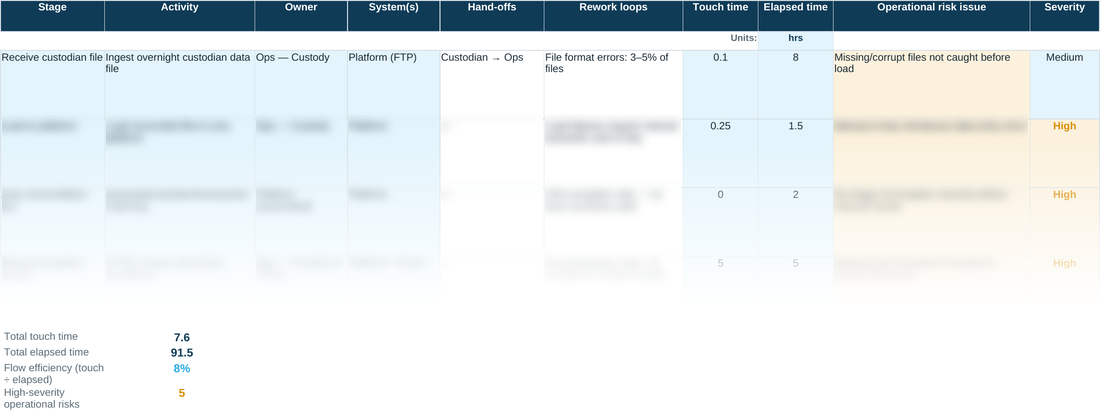
The baseline totals at the foot build themselves from the rows above, so total touch time, total elapsed time, flow efficiency and the count of high-severity risks are always a live reflection of what's actually in the sheet, not a number someone typed in once and forgot to update. Flow efficiency under roughly 15% is normal for a process that hasn't been redesigned yet — that's the finding this baseline exists to expose, not a sign the sheet is wrong; north of 40% is genuinely strong for admin-type work.
WHY THIS HELPS
Touch time and elapsed time are tracked separately. A stage can look fast on paper — low touch time — while the real gap sits in the elapsed time: hours or days spent waiting for someone else to pick it up. Splitting the two is what makes the eventual ‘quick win’ actually quick.
READING THE BASELINE
Touch time and elapsed time use exactly the same unit — set once for the whole sheet (hours, in the worked example). Flow efficiency is simply touch time divided by elapsed time: the share of the total time that was actually being worked, rather than sitting in a queue or waiting on someone else. As a rule of thumb, under about 15% is typical for an unreformed back-office process — that's not a mistake in the sheet, it's the opportunity this baseline exists to expose. 25–40% is a well-run process; above about 40% is genuinely strong for admin-type work. The worked example above comes out around 8%, which is normal for a process that hasn't been redesigned yet.
D1 · AS-IS Mapping — the blank tool
Ready to complete for your own engagement. Blue-tinted cells are for you to fill in.
Worked example
The same tool completed end to end, using the fictional Meridian Wealth Management scenario — see what ‘done’ looks like before you start your own.
A quick walkthrough of the sheet:
Need the full method, not just one step?
All eleven instruments — D1 through D10 and the Prioritisation Matrix — at a discount against buying them separately.