
In a sentence — work down the value chain, rank the few points that most limit flow, and trace each back to a root cause worth designing against.
Most diagnostic exercises end with a list of problems, not a decision. This tool is built to resist that: only a small number of rows can be ranked as constraints — usually one to three — and ranking a fourth forces you to reconcile which of the existing ones actually matters less.
The instruction ‘rank only the few that matter’ isn't a nicety — it's the whole discipline. It follows Goldratt's Theory of Constraints in spirit, adapted for regulated service environments: Goldratt's manufacturing world was sequential enough that one bottleneck usually explained the whole flow, but service organisations often run activities in parallel and depend on external factors that create more than one genuine limitation at once. Improving anything outside the ranked set doesn't move the whole flow, however productive it feels. A long list that hasn't been ranked isn't a diagnosis yet — it's just been narrowed.
WHY THIS HELPS
Evidence observed comes before ranking. The layout deliberately makes you write down what you actually saw before you're allowed to rank a row as a constraint, so the conclusion follows the evidence instead of the other way round.
WHY RANK, NOT LIST
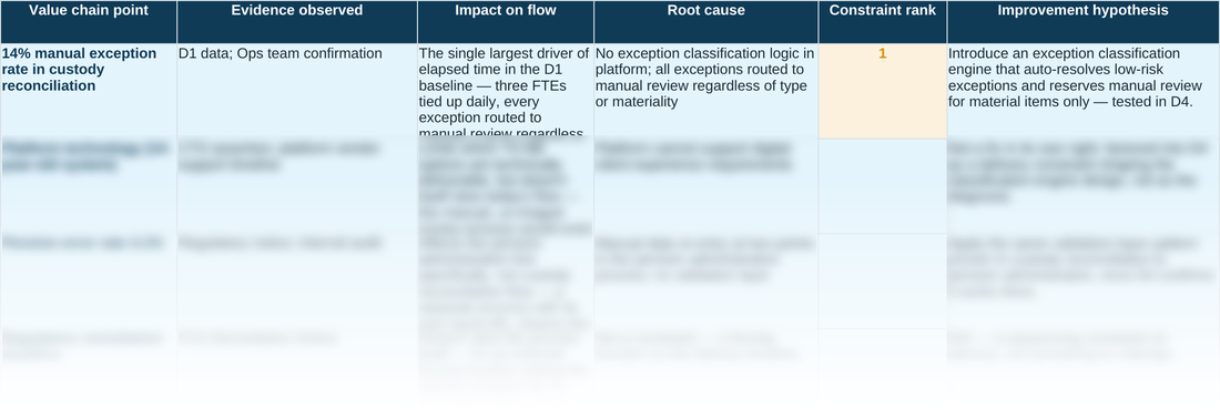
A system's throughput is limited by a small number of points at any given time — every other row, however inefficient, isn't what's capping the flow right now. Improving something outside that ranked set feels productive but doesn't move the end-to-end number, because a genuine constraint elsewhere absorbs the slack immediately. That's the actual reason the sheet insists on a short, ranked set rather than an open list: an unranked list of five problems still leaves you guessing which one to fix first, while a ranked top few tells you exactly where to spend the next unit of effort, in order. The worked example tests four real candidates — the exception rate, the legacy platform, a related pension error rate, and a regulatory deadline — and ranks the ones that clear a real bar for impact. The rest aren't dismissed as unimportant; the Impact on flow and Improvement hypothesis columns explain why each is a real issue that didn't make the ranked set, which is a different and more useful finding than simply listing them below it.
D2 · Constraint Analysis — the blank tool
Ready to complete for your own engagement. Blue-tinted cells are for you to fill in.
Worked example
The same tool completed end to end, using the fictional Meridian Wealth Management scenario — four real candidates tested, with the ones that clear the bar ranked in order and the rest explained via the Impact on flow and Improvement hypothesis columns, without being written off as unimportant.
A quick walkthrough of the sheet:
Need the full method, not just one step?
All eleven instruments — D1 through D10 and the Prioritisation Matrix — at a discount against buying them separately.