In a sentence — confirm the target operating model actually supports the redesigned process across every layer — not just the layer that was easiest to redesign.
Structure gets redesigned. Process gets redesigned. Then a new operating model quietly inherits the old technology, the old sourcing decisions, or the old resilience gaps, because nobody checked all four layers at once. This tool tests strategy, process, people and technology against the same explicit criteria, so nothing gets waved through by default.
Operational resilience gets its own dedicated section rather than being folded into ‘technology’ or treated as a control bolted on afterwards. It means the model keeps critical services running through an outage, a key-person absence, or a third-party failure — not just that it works on a good day, which is the same discipline the method applies to the TOM stage generally.
WHY THIS HELPS
Risk trend is tracked separately from risk severity, and the register itself is a separate test from the checklist above it: the checklist asks whether the design criteria are formally met, the register asks whether the operating model actually reduces the risks recorded back in D1. A High-risk item trending Reduced and one trending Increased look identical on a severity-only view; a tidy checklist next to an unmoved risk register is the sheet telling you something's wrong.
HOW MOVEMENT IS CALCULATED
Under the hood, Low/Medium/High is converted to 1/2/3 for both the AS-IS exposure and the Residual exposure you enter, and Movement is simply whichever way that number changed — Reduced if Residual is the lower number, Increased if it's higher, No change if they're equal. That means a shift from High to Medium counts exactly the same as a shift from Medium to Low: one severity step, regardless of which two labels are involved. It also means you can't fudge a small win into a big one — there's no partial credit for ‘still High but a bit better’. If a risk hasn't moved a whole severity band, the sheet correctly shows No change, which is often the more honest and more useful signal at this stage of a design.
D5 · TOM Design Checklist — the blank tool
Ready to complete for your own engagement. Blue-tinted cells are for you to fill in.
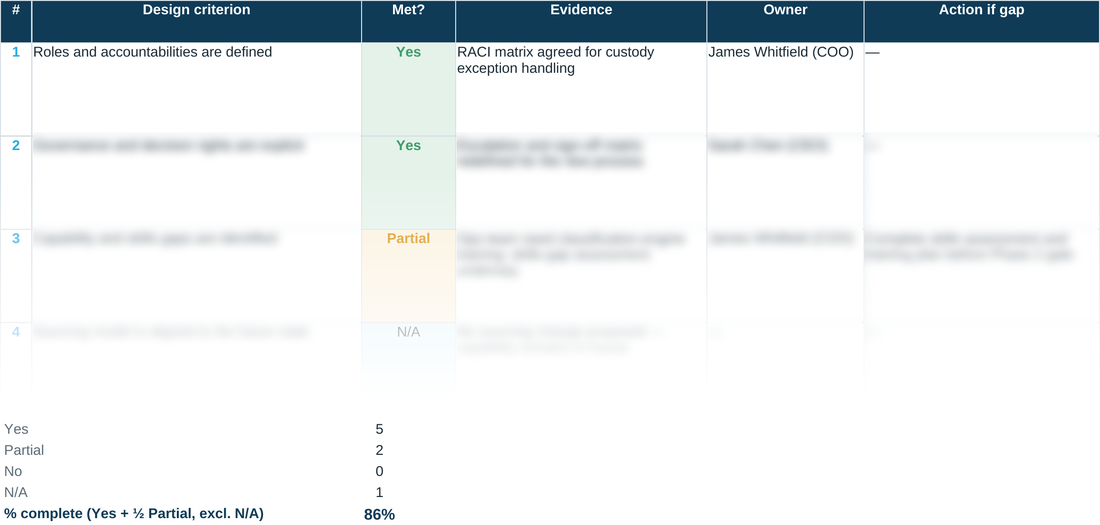
Worked example
The same tool completed end to end, using the fictional Meridian Wealth Management scenario — see what ‘done’ looks like before you start your own.
A quick walkthrough of the sheet:
Need the full method, not just one step?
All eleven instruments — D1 through D10 and the Prioritisation Matrix — at a discount against buying them separately.